ViBrant Health
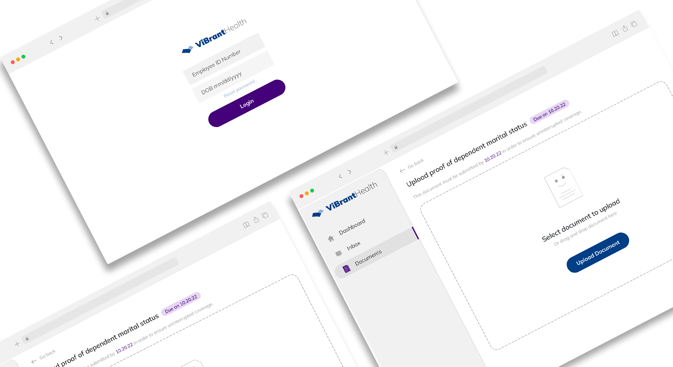
An insurance portal for uploading and submitting documents.
An insurance portal for uploading and submitting documents.
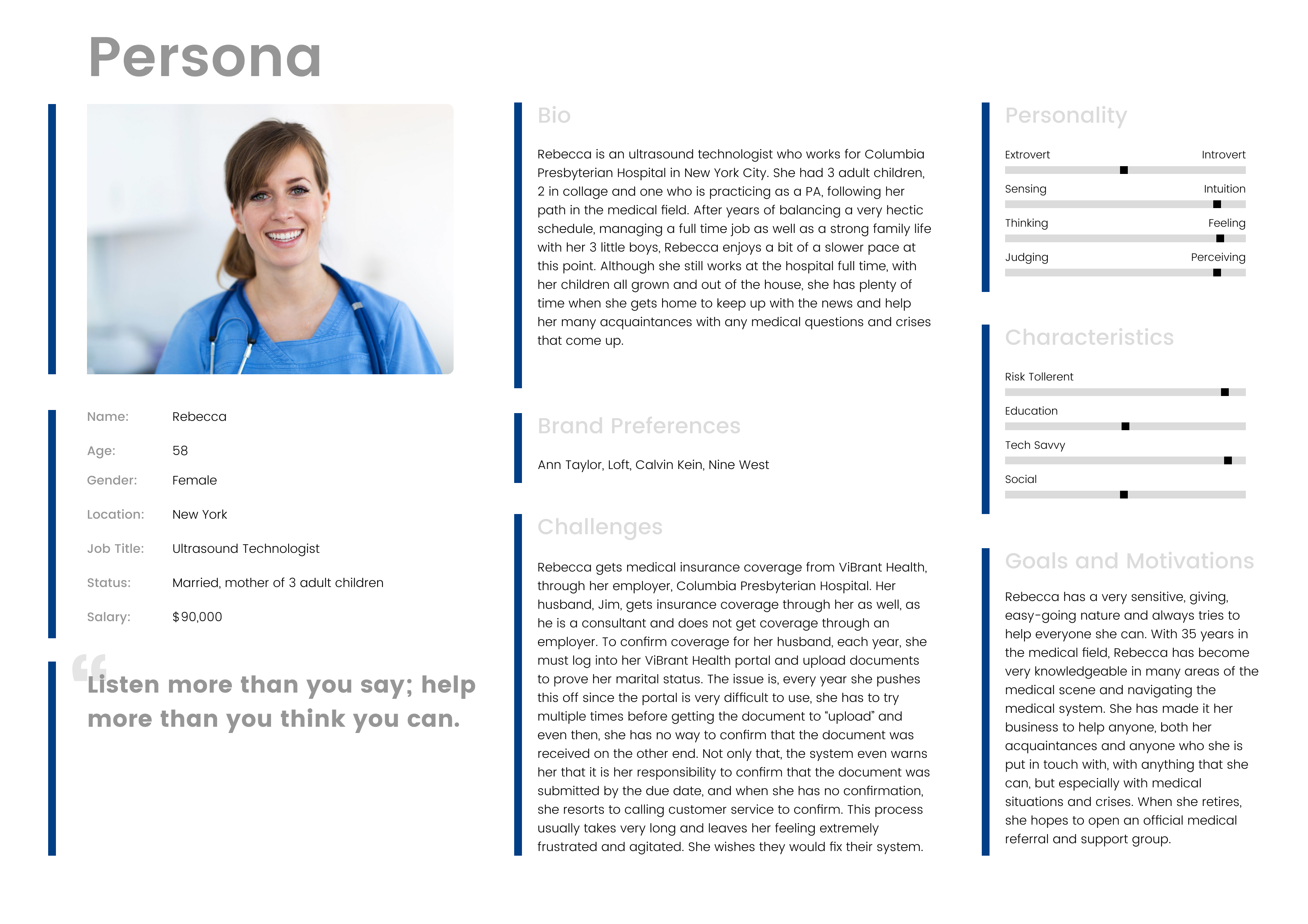
Rebecca is a healthcare employee who works at a major New York City hospital that provides medical insurance coverage to employees through ViBrant Health. Rebecca needed to prove her marital status as it directly effects who in her family is eligible for coverage through ViBrand Health. For that, she needed to upload documents to her employee portal at ViBrant Health. After logging in, Rebecca tried, unsuccessfully, to upload the required documents for over an hour. Extremely frustrated, she turned to me for help and I was able to assist her in uploading the required documents.
While watching Rebecca work within the ViBrant Health system, though, I understood why Rebecca had so much trouble accomplishing the simple task of uploading a document. The ViBrant Health interface had major UX deficiencies, was not addressing the needs and values of its users and was therefore not usable and creating a very bad user experience.
This got me thinking and I wanted to design an interface that would give ViBrant Health users a smooth and pleasant user experience, that was usable and engaging. First, though, I had to do some research to better understand the users and the industry.
As I set out on this mission, I began my research by spending more time looking through the ViBrant Health application so that I can gain a better understanding of their current product and how it is used.
After that, I set out to get information directly from ViBrant Health users so that I can gain insight into their needs, feelings, thoughts, values and experiences. To do this, I wanted to engage and get as close to the users as possible, ask open-ended, non-leading questions that would help me gain accurate information. I also wanted to be able to observe their behaviors in conjunction with listening to them.
To do this, I conducted interviews.
Some of the questions I asked were:
I then spent time doing competitive research, exploring insurance industry applications by competing insurance companies so that I can have a better understanding of the industry, its needs and standards.
After engaging with ViBrant Health users, and researching the industry I went on to analyze the information I had documented.
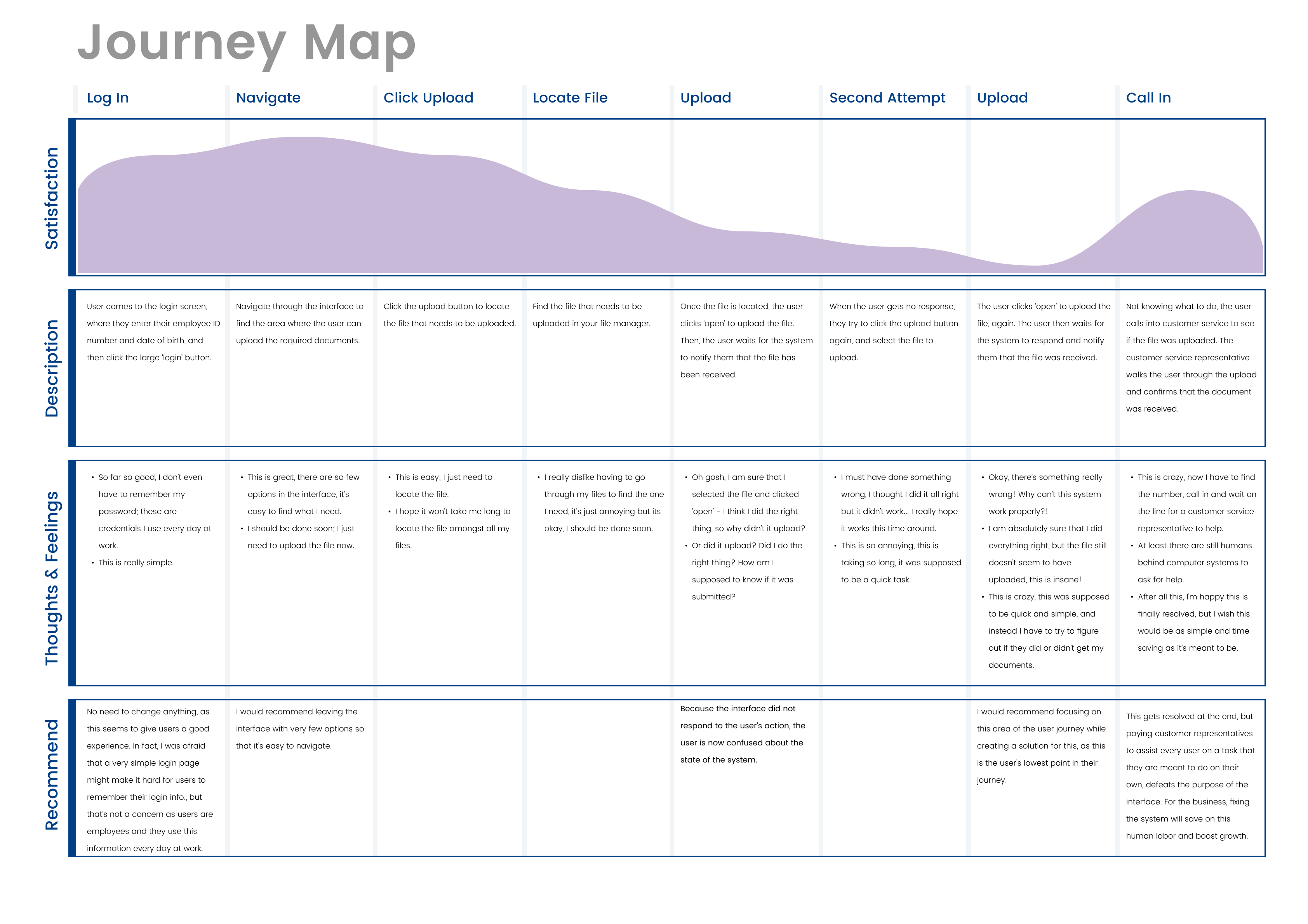
I documented the information that I had gathered by creating an empathy map, journey map and personas so that I can draw insights and frame the problem that they are facing.
Some of the insights I gained were:
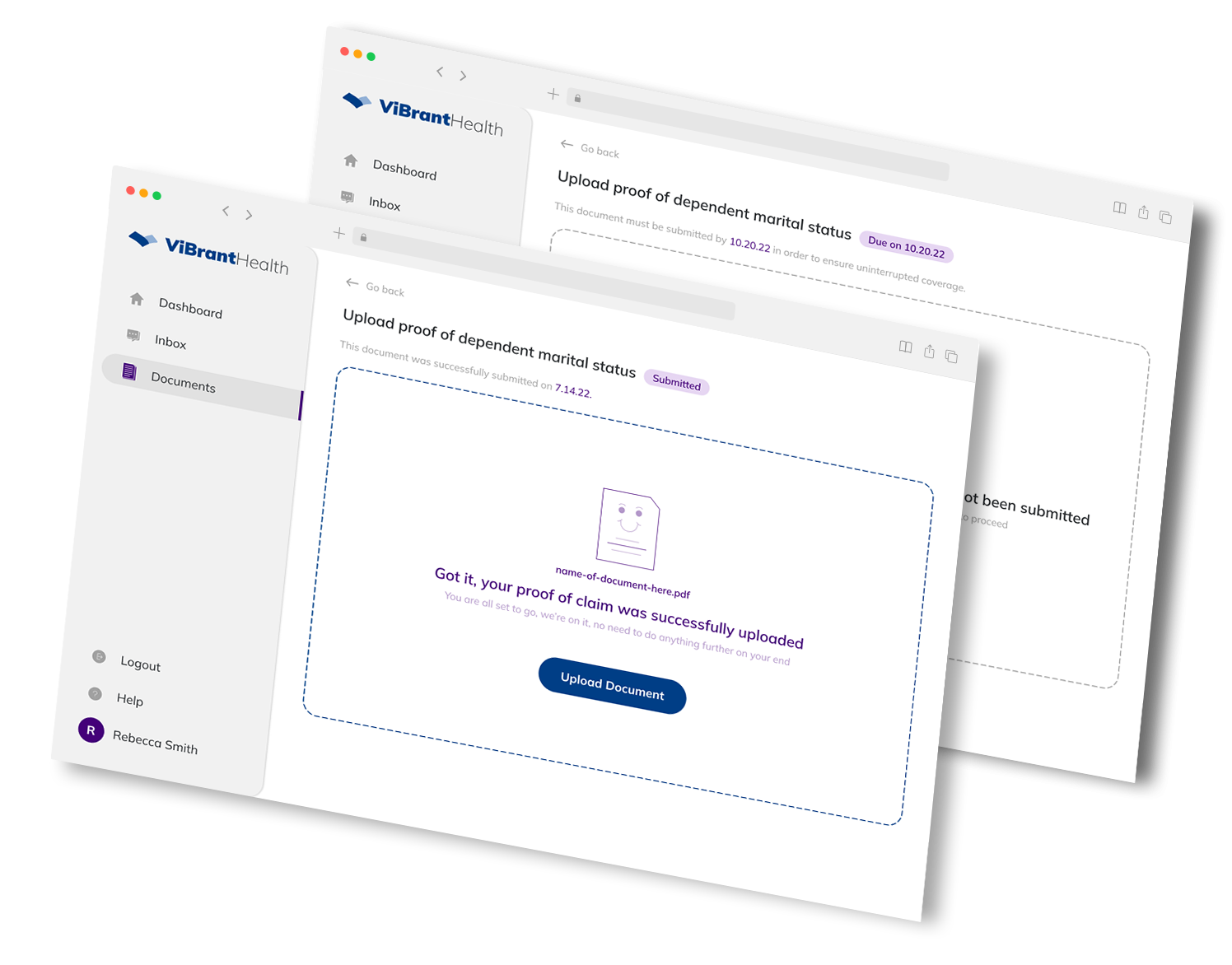
Most of the time ViBrant Health application users use the platform to upload required documents.
Users expressed feelings of frustration after using the application, which seemed to be because it was very difficult to navigate and, in particular, because they found it grueling to upload documents to the system, expressing confusion and lack of trust, not knowing if the document was indeed uploaded or not and being afraid that they may have done something wrong in submitting the document. They said that in order to resolve their issue with the document upload; they usually call into ViBrant Health’s customer service to confirm that the document was successfully submitted.
In addition, users seemed to like that the application had very few call to action options, as it makes it easier for them to find what they need, but that they wish the application was easier to navigate and simpler to use. Their frustrations and behaviors also seemed to show that they would greatly benefit from a messaging area added to the portal so that if they do have a question, they can simply ask the question directly within the application.
While watching employees work, I noticed a warning within the application letting the user know that it is their responsibility to ensure that documents were submitted by the required due date. This made me think that perhaps they have added that warning since users constantly find themselves confused as to whether their documents were submitted or not.
By creating a new application that gives ViBrant Health users a seamless user experience while trying to upload and submit documents, employees will no longer be needed to assist users with this simple task and instead, employees will be able to dedicate their time to do productive tasks that will benefit the growth of ViBrant Health.
Since this was a creative endeavor for me and I did not have access to too many users, I found it frustrating to work with such a small amount of information. I would have loved to be able to:
Since this was an issue that I found, I decided to venture out and take this on in order to push my creative abilities, so I had to work within the limits of what I had access to.
Once I understood ViBrant Health’s users, their pain points and the overall industry requirements, I was then able to compare those findings to my original analysis and assumptions about the application. Based on the take-aways and insights, I moved forward with brainstorming various possible solutions.
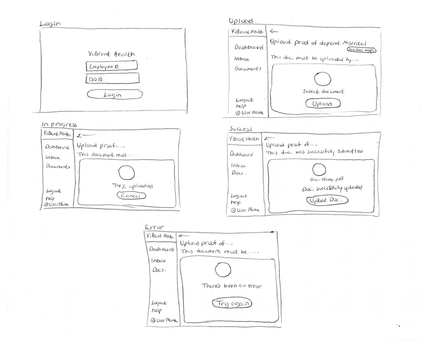
After ideating on this a number of times I moved forward with creating prototypes so that I can try some of my ideas out. Then, I presented my prototypes to the users in order to test them out and get feedback, see if they were a good solution, better understand and empathize with the users and better understand their problem. During this process there were a number of elements that I had to deliberate and I used the research I had done as well as user testing to come up with the best resolution.
One example of this is the ‘documents’ option in the menu; I thought about having a ‘documents’ option as well as a ‘tasks’ option where users can track their open tasks. I wasn’t sure it having the ‘tasks’ option would make it easier for the user by separating ‘tasks’ from ‘documents’ or if it would make it more confusing. Although I would normally assume that it would be easier to separate ‘documents’ from ‘tasks’, allowing the user to manage their tasks in a dedicated area and upload documents in another, I thought that in this case, since users liked fewer options and mostly use this application for uploading documents as opposed to other tasks, it would be a better solution to have just one option for ‘documents’. I went about settling this decision by performing some A/B testing with the users and my prototypes to find out what my users would find more pleasant.
After testing, I found that the users were more comfortable with having just the ‘documents’ option, it made it simpler and clearer, while adding ‘tasks’ just created confusion to the user.
Based on feedback, I iterated on my solution and changed my prototype, until my solution clearly resolved my users' problem.
During this process, after the initial wireframe was complete, before moving on to creating the prototype, I decided to focus on the document upload section of the application since that seemed to be the most used section.

While creating the high fidelity prototype, I found it challenging to design the application in a creative way while keeping it corporate and professional.
This was a creative endeavor for me, focused on design thinking and process; but this design still needs a lot more user research, user testing, and refinement, in order to better understand the problem and create the best solution. In the future, additional sections of the application should be built out as well, such as the dashboard, messaging system etc.