PostMan
A mobile app to manage all messaging apps in one central location.
A mobile app to manage all messaging apps in one central location.
Today there are so many digital messaging application; various email applications such as Gmail, HotMail, OutLook etc., texting, WhatsApp, Telegram, not to mention all the social media networks where people message each other as well.
These applications are extremely convenient and each one gives users its own options, flavor and access to different acquaintances and communities. With all these conveniences comes what I call, “scattered messaging,” which means that people have messages in so many different applications, it’s hard to keep track and find the messages that they need when they need them.
Before I could come up with a solution to this problem, I had to do some research to better understand my potential users and their problem. I started with some informal research with as many people as I could to find out who might be interested in this solution and hence who my target users would be.
In order to do this research, I wanted to engage with potential users; here are some of the questions I had:
Once I had a better understanding of who my target audience was, I proceeded to do some market research. First, I wanted to see what other solutions are already out there, so I can analyze them and identify what areas these solutions excel in and what areas they fall short in so that I can use these findings to help my application be a more improved solution that stands out in the market and addresses what other applications do not.
Interestingly, I only found one app that even addresses this problem. Then, once I started exploring it, I found that this app had some major UX issues. Firstly, its aesthetic was not coherent or consistent, each screen had its own look, and a bit of a different layout, which can be confusing to users, who will perceive the application as being less usable.
What I found great was that the application was very lean and had no extra features, only a simple central station for the other messaging apps; any other features were nicely done on the messaging applications themselves, they were not needed here, so anything added would just weigh down and take away from simplicity of a central messaging application.
However, what was lacking on the application was the ability to actually see the new messages and search contacts or key words within the app. Meaning, this application functioned simply as a link to the source messaging apps, so you can find all messages one area, but it did not tell you if any new emails came in, for example, or give you the ability to search all your contacts across all messaging applications. So users still have to go from app to app searching and checking.
Since this was only my assumptions, I went back to my users to test this application with them and watch them work; after sitting with them, I was able to confirm my findings above; they mostly found that the simplicity of the app was great, no extra features were needed but that if there was no way to see all new message, see what app they came in through and have access to all messages and contacts within this one application, then it was missing a lot of the solution they needed.
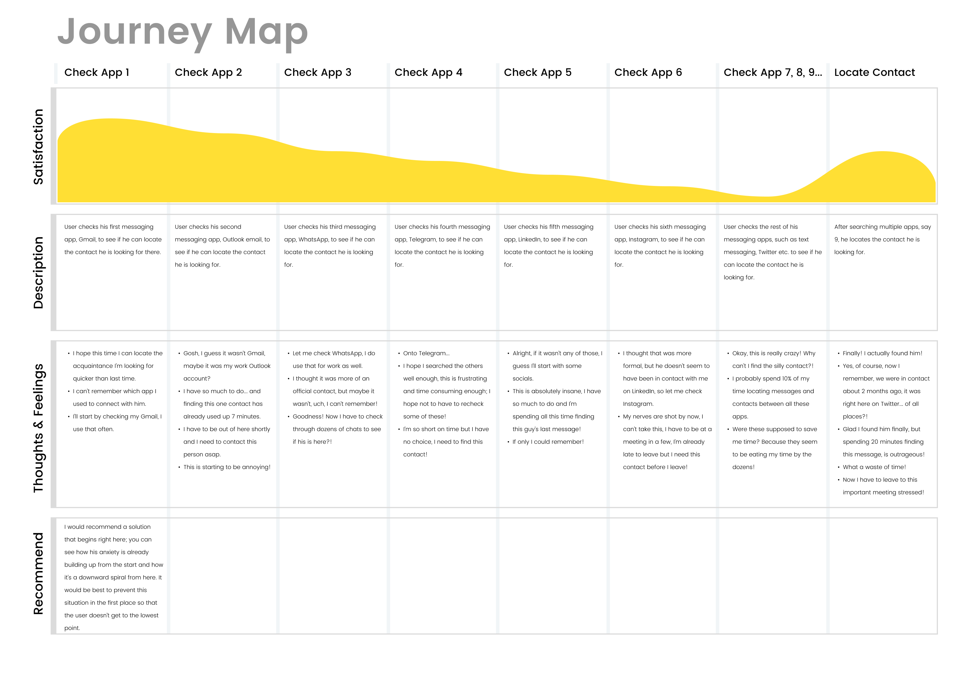
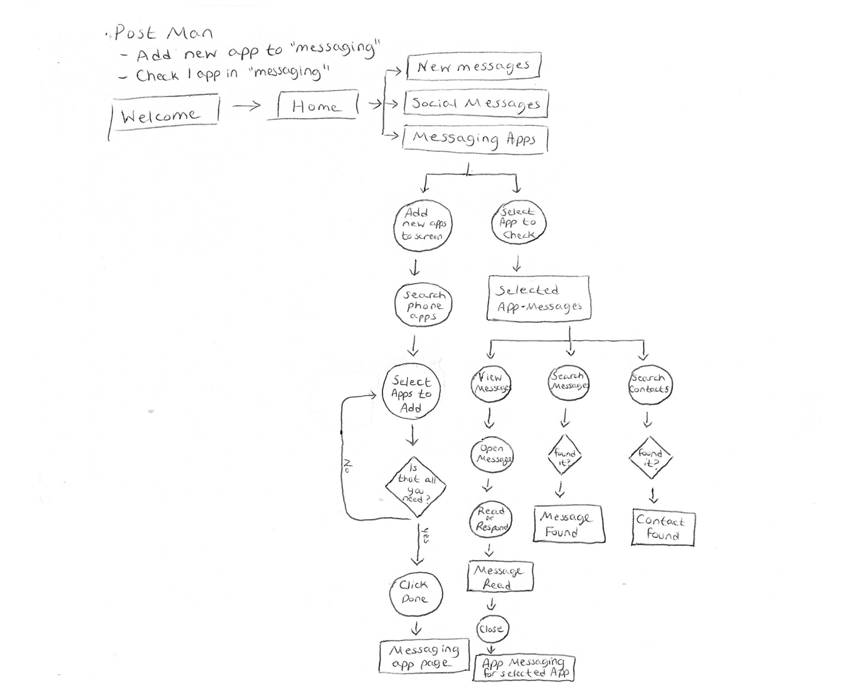
Once I had done some research, I was ready to document my findings so that I can draw insight, create a point of view and frame my users’ problem so that I can ultimately work on a good solution.
I documented the information I had gathered by creating a journey map, empathy maps, and personas.
Here is some of what I found:
More generally, I found that my potential users spend a lot of extra time trying to find “a needle in a hay stack” when searching through multiple apps to find the one contact or message they’re looking for. Also, when checking for new messages, they need to check numerous applications just to be up to date on their correspondence.
Interestingly, I observed how people use messaging applications to save time that they would have had to spend on the phone, but instead, they now have so many applications to keep track of, they’ve sort of just re-distributed the time to managing their messaging applications.
I’ve noticed that this is especially an issue with business people and owners who use messaging as a main resource for networking and connecting with clients or potential prospects. This is clearly a bad user experience for users who rely on several messaging apps for their everyday tasks.
I realized that there had to be a way to centralize peoples’ messaging so that they can check and find messages in one place.
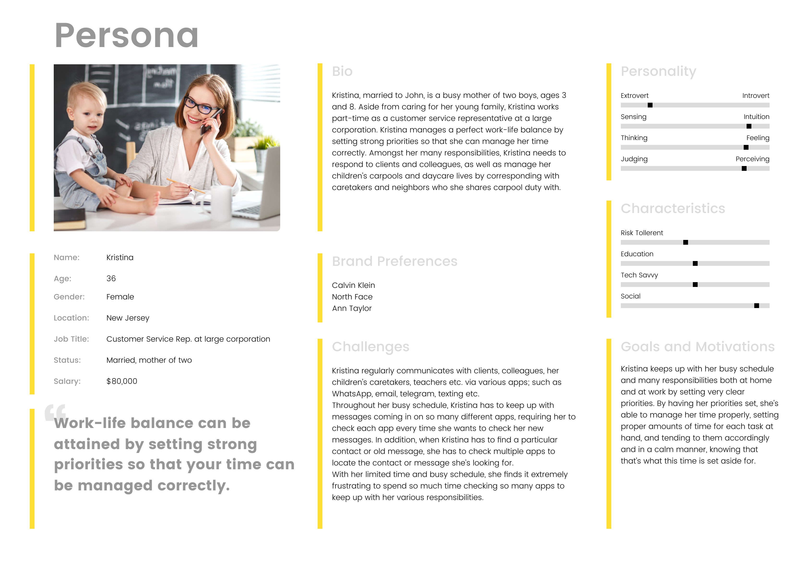
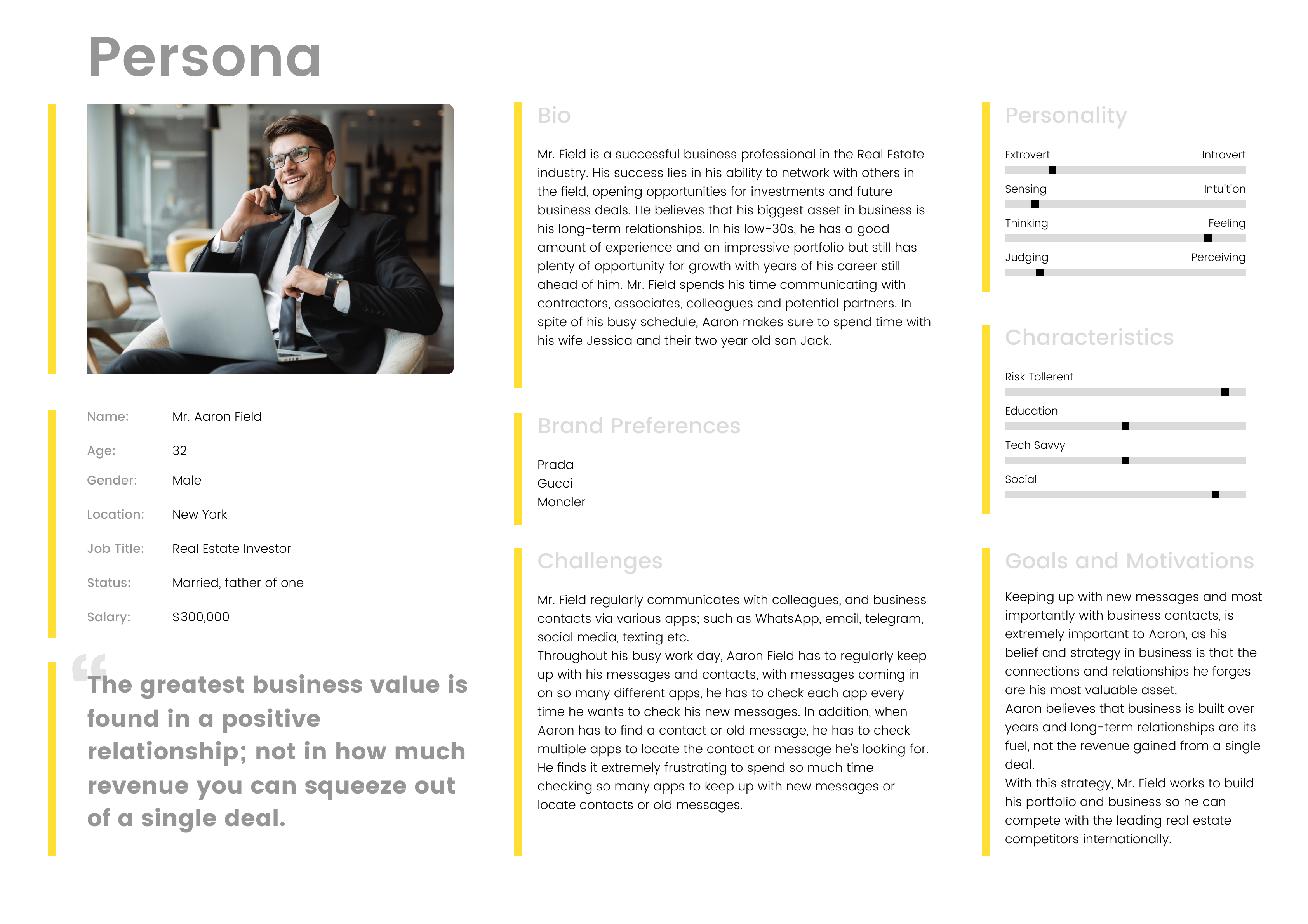
Based on my research and findings I created 2 personas for this application:
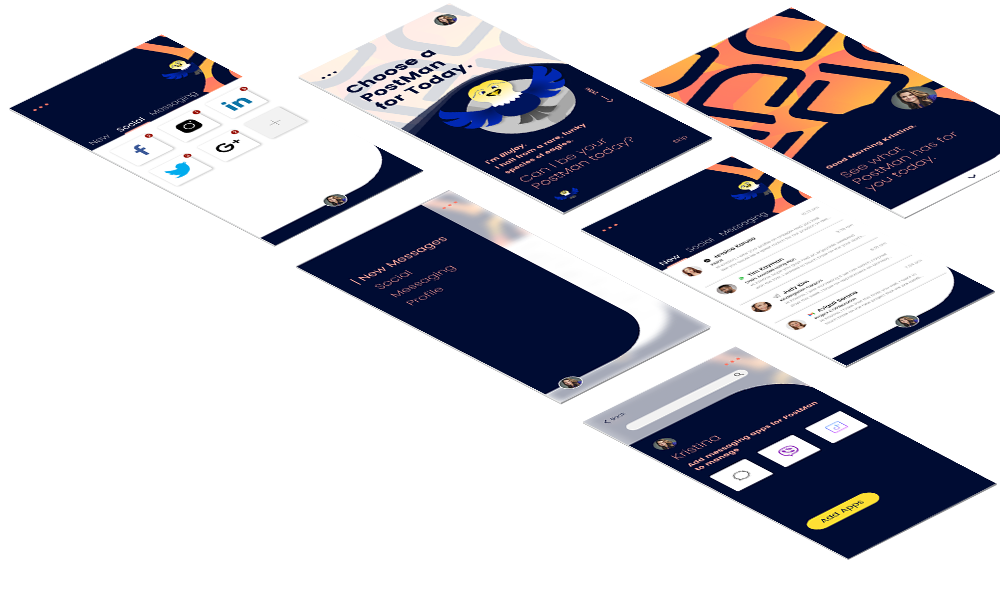
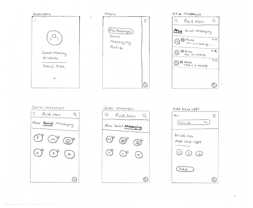
Now that I had a better understanding of who my users are and their pain points, as well as the overall market; I began generating ideas and exploring potential solutions. During this process I created wireframes, prototypes, assets, components, design system and information architecture by conducting card sorting sessions with my users.
After analyzing and ideating on this myself, I presented my prototypes to the users in order to test them out, see how they were able to be used and get some feedback. During this process there were a number of elements that I had to deliberate and I used the research I had done as well as user testing, including A/B testing, to empathize with my users and come up with the best solution for them.
Based on feedback, I iterated on my solution and changed my prototype, until my solution clearly resolved my users' problem.
By creating a central system where users can access all their messaging applications as opposed to having each one in a different place, users will benefit by:
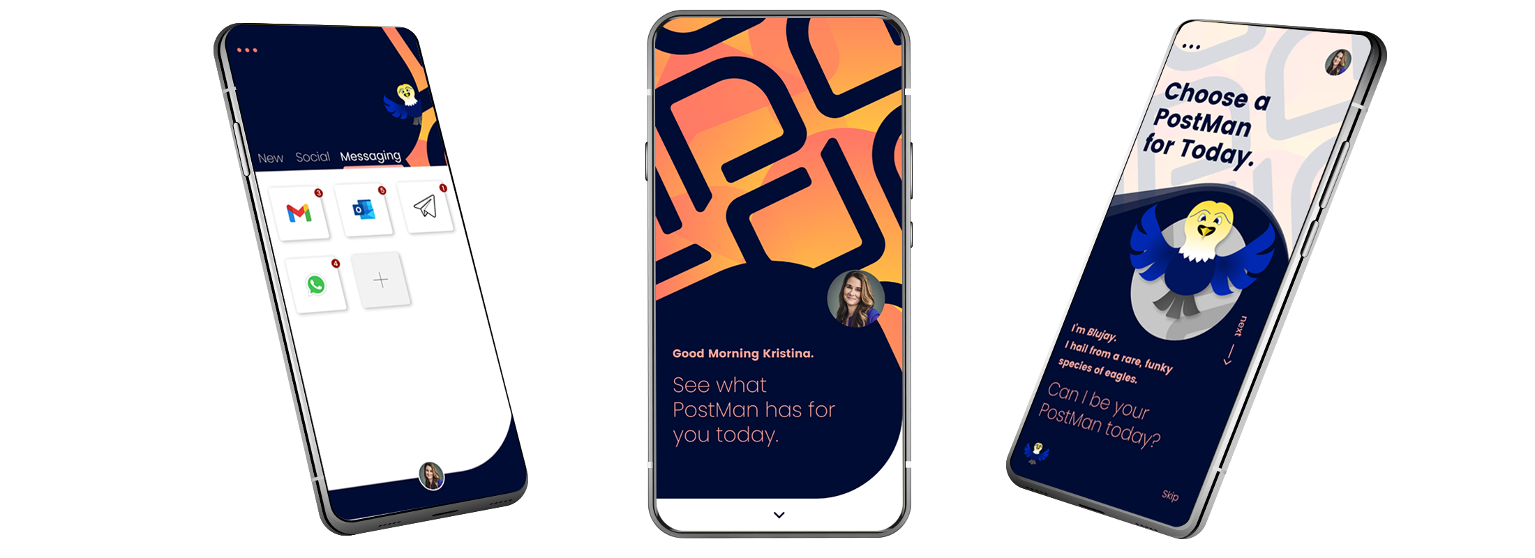
As I neared the end of iterating through ideation and testing to finalize the app solution, I thought about my users' busy schedule and I wanted to add something memorable and unusual to tick on their brain's central executive network and help them focus on the tasks they are trying to accomplish, without disturbing the app's usability; hence creating a great user experience.
I did this by creating a cartoon like character of an eagle, the US Postal Service symbol, echoing the app's theme of faithfully delivering all messages to one location. I creating 3 versions of the character and gave each one a different name, in line with its body color; Blujay, Ruby and Yella. I then proceeded to give the user a chance to choose their "PostMan" or mailman for the day, once the user chooses a character, it "peeks" in at the top of each subsequent screen, creating a nice visual language. In order to ensure that usability is not disturbed, I added a 'skip' button too, to allow users to opt out of this feature, if they don't want to choose a character.
I then went back to my users to test the addition to my design, I did this by watching them work and waited to see their initial reaction to the new feature. The users were delighted with the design change, describing it as 'sophisticated', they found it interesting and exciting; which would add value to my digital product. However, users went right to the 'skip' button and avoided choosing a PostMan. Using my perception as I watched them work, I saw that they had no frustration and found the 'skip' button right away, but they skipped choosing the PostMan simply to avoid spending time doing something that is not needed. At first, this made me think that I should remove the feature if users were choosing to 'skip' it; but then I thought of the users and realized that this did not cause them to become frustrated or confused, in fact, it made them smile, ultimately giving them a better user experience. I realized from this that all because a user doesn't take advantage of a feature or even consciously notice a design element, just having it there, lending value to the design, might actually elevate the user's experience. I, therefore, chose to leave the feature in, however, this would need further user testing.
A challenge that I had in this process is that since this was a creative endeavor for me and I did not have access to too many users within the time I had to create this (outside of work), I found it frustrating to work with such a small amount of research and testing. I would have preferred to be able to survey and perform user testing with dozens of users in a methodical way throughout the process.
Since this was an issue that I found, I decided to venture out, take this on and find a solution in order to push my creativity and analytical capabilities, even though I did not have access to enough user research and testing.
This design still needs additional qualitative and quantitative user research and structured user testing, but for now, I came up with the best solution based on the very limited resources I had while exploring this creative process.
I also learnt that although there are thousands of apps out there and many solutions to existing and obvious problems, there is always room for improvement and better solutions.